flex 网页布局
•
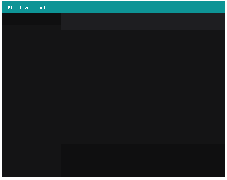
用过Qt的QHBoxLayout,QVBoxLayout再看flex布局有很多相似之处,特别要注意的是flex属性是flex-grow, flex-shrink 和 flex-basis的简写,默认值为0 1 auto,后面两个是可以省略的。当一个容器没有显示出来时要注意它应该设置宽高或者flex值是不是大于0。
<!DOCTYPE html>
<html lang="en">
<head>
    <meta charset="UTF-8">
    <title>Document</title>
    <style type="text/css">
        body {
            display: flex;
            flex-direction: row;
            background-color: rgb(255, 255, 255);
            justify-content: center;
        }
        .main {
            display: flex;
            flex-direction: column;
            background-color: rgb(15, 15, 16);
            width: 760px;
            height: 600px;
            border: 1px solid rgb(14, 148, 150);
            -webkit-border-radius: 5px 5px 0px 0px;
            border-radius:5px 5px 0px 0px;
        }
        .title {
            display: inline-flex;
            height: 40px;
            background-color: rgb(14, 148, 150);
            color: rgb(255, 255, 255);
            align-items: center;
            padding-left: 20px;
        }
        .content {
            display: flex;
            flex-direction: row;
            flex: 1;
        }
        .left {
            border-right: 1px solid rgb(60, 60, 65);
            background-color: rgb(20, 20, 21);
            width: 200px;
        }
        .left .search {
            display: flex;
        }
        .left .searchInput {
            flex: 1;
            height: 38px;
            background-color: rgb(15, 15, 16);
            font-size: 14px;
            border: none;
            border-bottom: 1px solid rgb(46, 46, 51);
            color: rgb(255, 255, 255);
            padding-left: 5px;
            padding-right: 5px;
        }

        .right {
            display: flex;
            flex: 1;
            flex-direction: column;
        }
        .right .profile {
            flex: 1;
            background-color: rgb(30, 30, 33);
            border-bottom: 1px solid rgb(69, 69, 75);
        }
        .right .chat {
            flex: 7;
            background-color: rgb(20, 20, 21);
        }
        .right .input {
            flex: 2;
            background-color: rgb(15, 15, 16);
            border-top: 1px solid rgb(50, 52, 56);
        }
    </style>
</head>
<body>
    <div class="main">
        <div class="title">
            Flex Layout Test
        </div>
        <div class="content">
            <div class="left">
                <div class="search">
                    <input class="searchInput" type="text">
                </div>
                <div class="list">
                </div>
            </div>
            <div class="right">
                <div class="profile">
                </div>
                <div class="chat">
                </div>
                <div class="input">
                </div>
            </div>
        </div>
    </div>
</body>
</html>
效果图